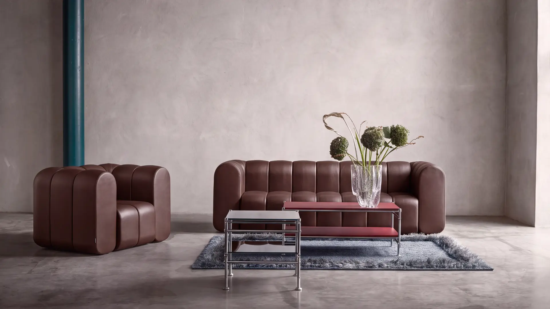
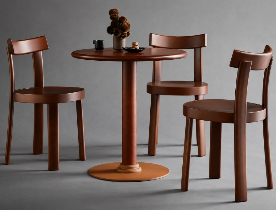
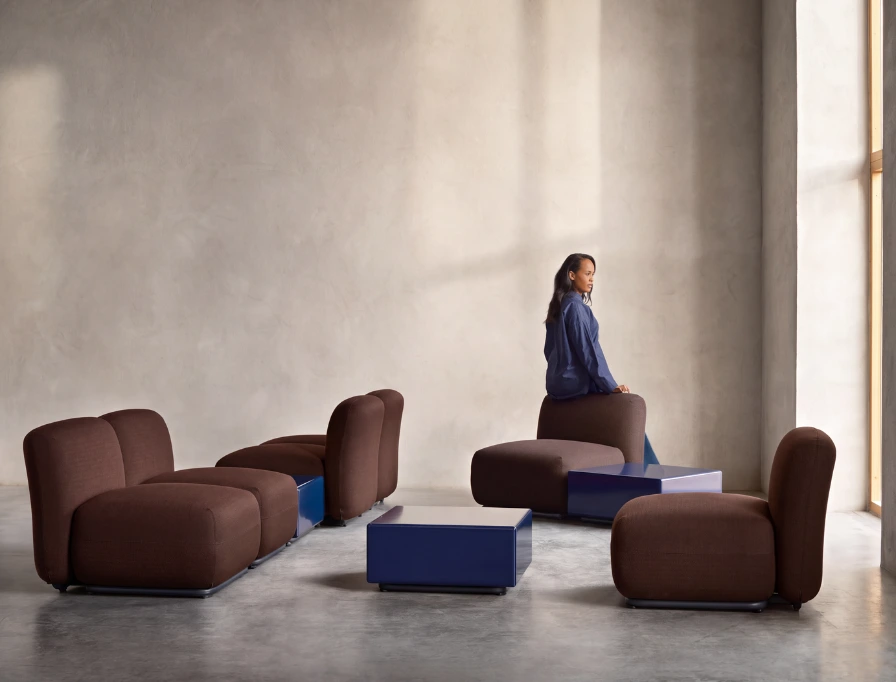
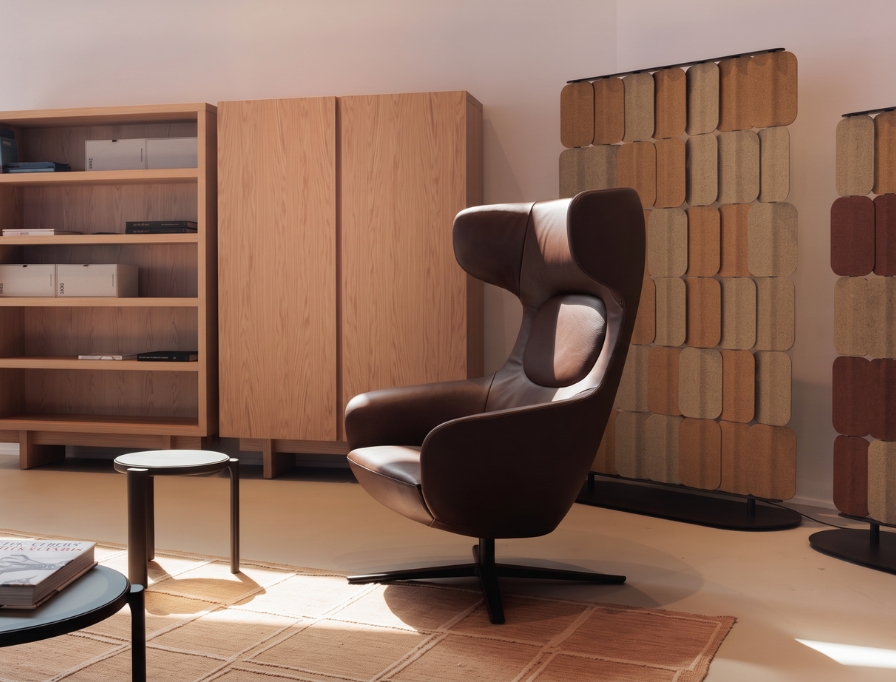
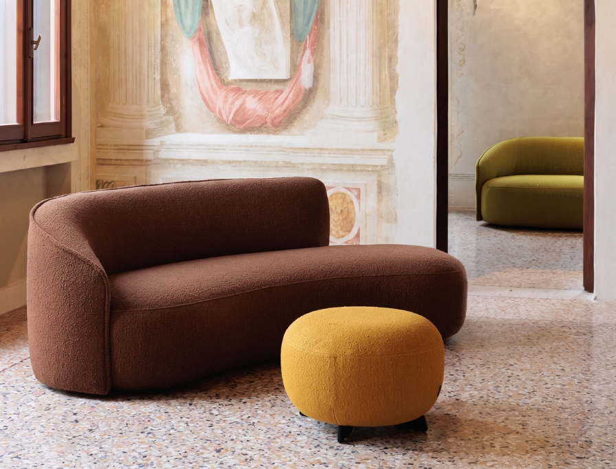
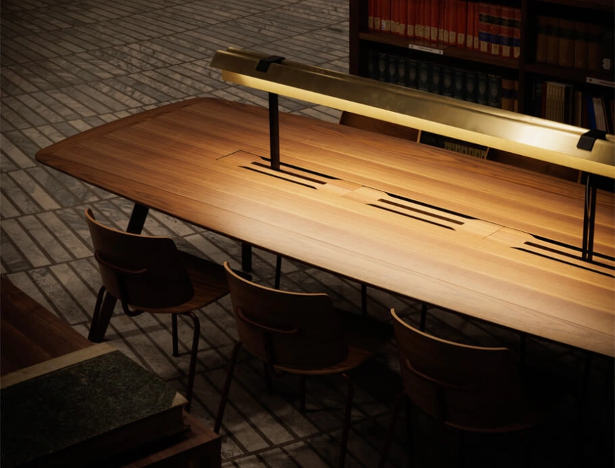
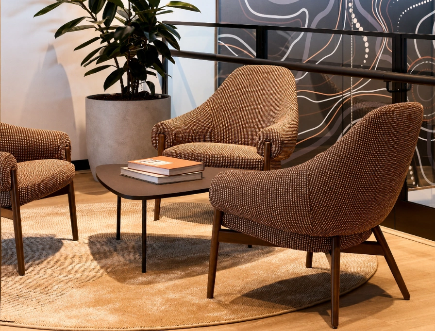
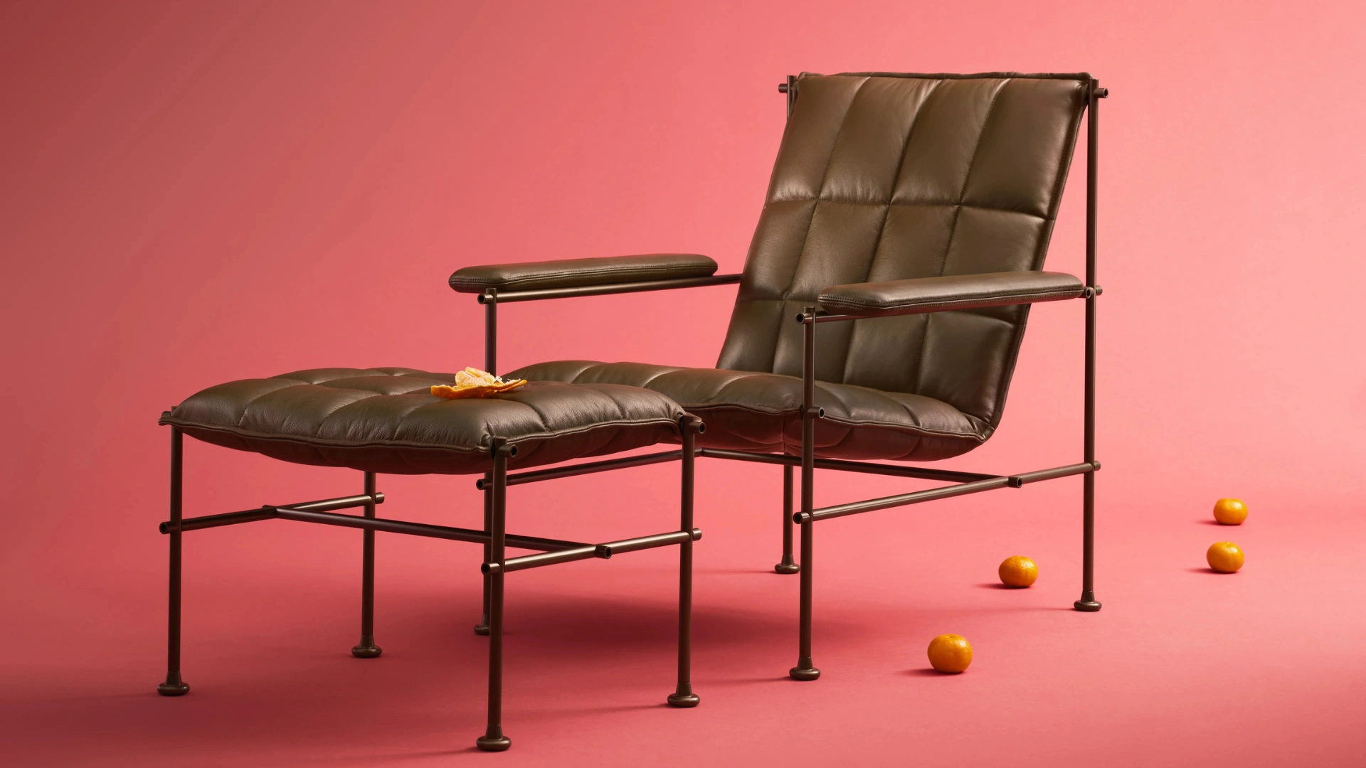
After years of pale beige, greige and cool grey, you’re probably noticing interiors moving somewhere richer. Chocolate brown has emerged as a defining colour in contemporary design, bringing warmth, depth and renewed confidence to residential, workplace and hospitality spaces.
Familiar yet expressive, it offers the versatility of a neutral with far greater presence. Use it to ground an entire interior, establish a focal point, or add depth through a single considered piece.
BOB
Blå Station
A return to warmth.
If you’ve found lighter neutrals starting to feel impersonal without enough contrast or texture, chocolate brown is the fix. It introduces warmth without sacrificing restraint, assured and sophisticated, yet quiet enough to sit behind a wide range of materials and colours.
That makes it a useful starting point if you’re trying to create spaces that feel welcoming and established rather than austere.
Chocolate brown carries strong associations with the natural world: timber, earth, leather, coffee, and cacao. Those associations give a space immediate material familiarity and a sense of connection to its surroundings.
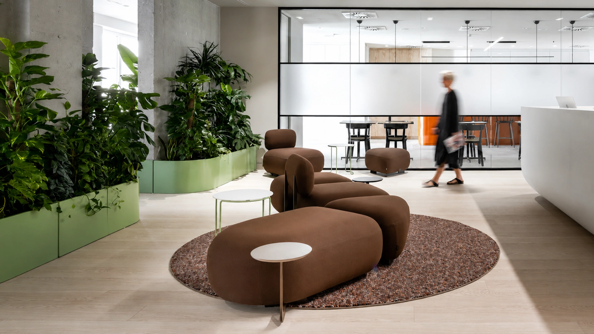
In a workplace, it softens collaborative and breakout areas. In hospitality, it builds intimacy and encourages guests to linger. Across residential and accommodation projects, it supports the comfort and retreat your clients keep asking for.
Unlike black, which can read as sharp or severe, chocolate brown gives you visual weight with a softer edge. It defines a space without tipping it into formal.
How chocolate brown reads depends heavily on surface, so material selection matters.
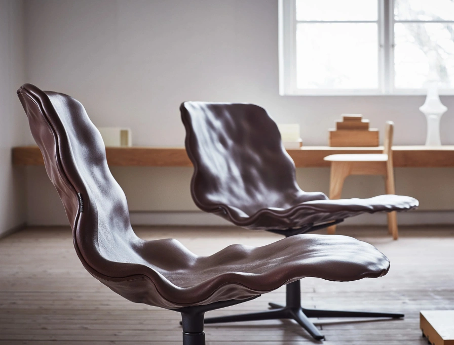
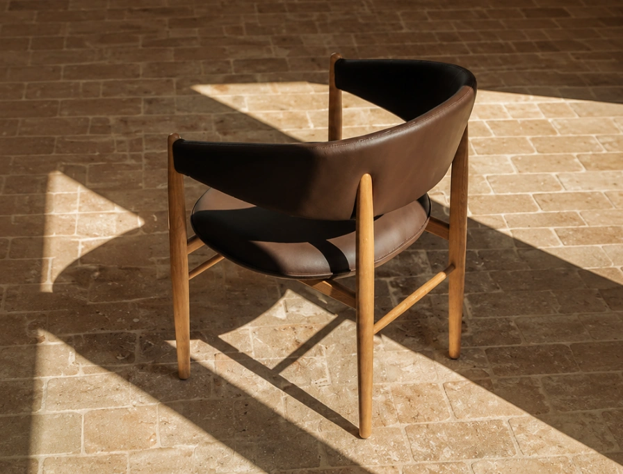
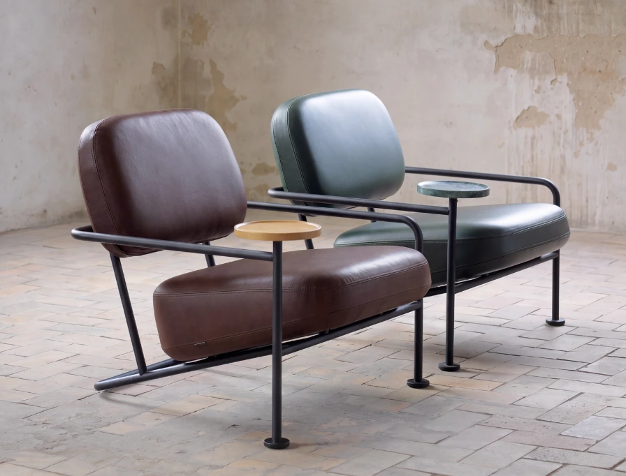
In bouclé, it feels soft and cocooning. In leather, assured and enduring, gaining character as it ages. In timber and veneer, grounded and architectural. Across wool, felt and woven upholstery, it brings warmth you can feel as well as see.
Gloss takes it somewhere else entirely: a chocolate lacquer or polished surface reads refined and contemporary, especially against restrained architectural detailing. Matte finishes absorb light instead, creating a quieter, more enveloping atmosphere.
Code
True
A versatile specification.
Chocolate brown works across a considered material palette, giving it considerable range.
For a calm, tonal scheme, pair it with cream, stone, oatmeal and pale oak, letting the lighter shades provide contrast while brown stays the anchor. For more richness, try it with burgundy, oxblood or forest green for a more intimate, dramatic result, particularly useful in hospitality and executive settings.
Unexpected accents can keep it feeling fresh: plaster pink softens it, pale blue cools it down, and butter yellow, muted orange or terracotta bring energy without disrupting its grounded quality.
Metal finishes add another layer. Brushed brass and aged bronze play up the warmth; stainless steel and cooler metallics sharpen it into something more contemporary.
At Milan Design Week, chocolate, caramel and toasted-coffee tones appeared across sofas, occasional furniture, rugs and decorative finishes, usually paired with tactile upholstery, timber, stone and subtly reflective surfaces.
Closer to home, you’ll find chocolate bouclé, dark timber and richly toned upholstery moving into Australian showrooms and specification libraries. Brown isn’t a minor decorative accent anymore. It’s become a genuine part of the contemporary furniture palette, specified across categories rather than confined to styled imagery.
AHUS
Blå Station
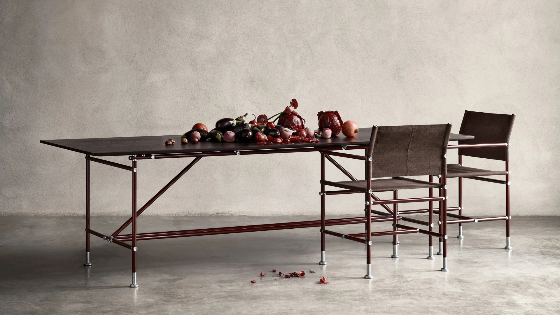
ABLE TABLE
Blå Station
VILLHEM
Blå Station
More enduring than a trend.
Timber, leather, wool and earth-derived colours have long played a role in interiors that last, and brown wears gracefully, making it a practical choice for high-use workplace, education and hospitality environments.
Its staying power comes down to balance: luxurious without being ostentatious, warm without going rustic, expressive without limiting the rest of your scheme.
Beige offered neutrality by receding into the background. Chocolate brown offers neutrality with presence.
Make it chocolate brown with P4.
You don’t need to source a new range to bring this palette into your project.
Most products across the P4 collection can be specified in chocolate brown through our custom upholstery and local manufacturing service, so you’re working with pieces you already know and trust, just in the tone your project calls for.
Our team works with you on the details that matter: the exact shade, the textile or leather, the finish, the performance rating. Whether you need a single hero piece or a full fit-out specified consistently across categories, we can match tone and texture across your entire palette, not just approximate it.
And because it’s local, you get shorter lead times and more flexibility to adjust as your project develops, without the compromises that come with importing a fixed range.